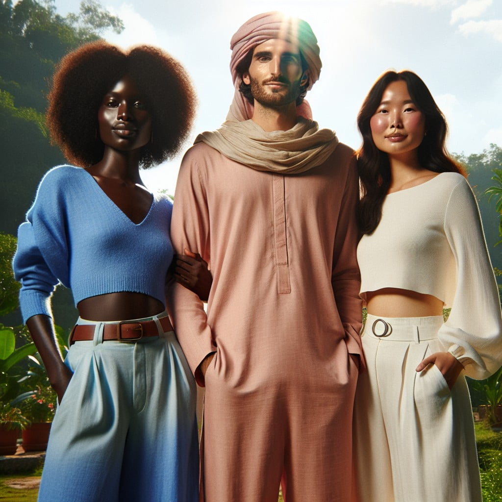
Planning outdoor wedding photography requires careful consideration, especially of the colors to wear, because choosing the right hues can significantly enhance the visual appeal and create breathtakingly beautiful images.
PURPLE, CREAM, AND BROWN
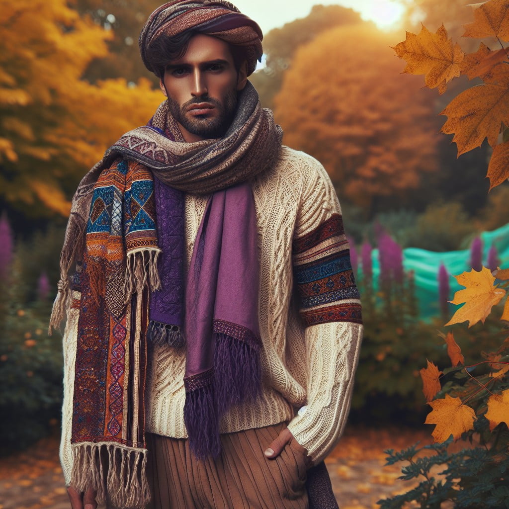
Combining purple, cream, and brown for outdoor photos creates a warm, sophisticated palette that stands out against natural backdrops.
Deep purples add a touch of elegance and complement the earthiness of brown, while cream offers a soft neutral base that highlights the face.
This trio harmonizes well in autumn environments, contrasting beautifully with the changing leaves and softer light.
EMERALD GREEN AND GOLD
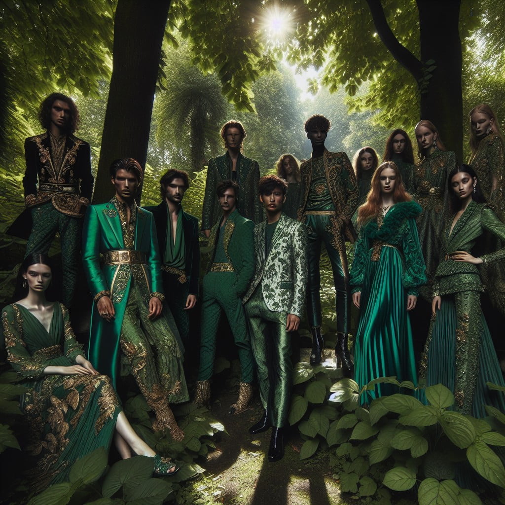
Emerald green and gold create a luxurious and timeless look, perfect for capturing elegance in outdoor photos.
The rich contrast between the deep, vibrant green and the shimmering gold accentuates natural light and foliage.
This color combination stands out against both lush landscapes and urban settings, making it versatile for various outdoor backdrops.
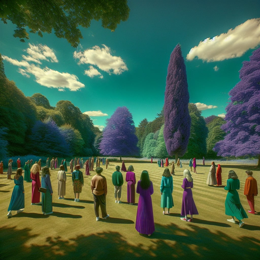
LILAC, NAVY AND GREY
Combining lilac and navy offers a harmonious balance where the softness of lilac lightens the mood while navy adds depth and sophistication.
Grey acts as a neutral backdrop, ensuring that both colors pop without competing for attention.
This palette works beautifully for outdoor photos, echoing the tranquility of nature and providing a timeless elegance.
TEAL AND ORANGE
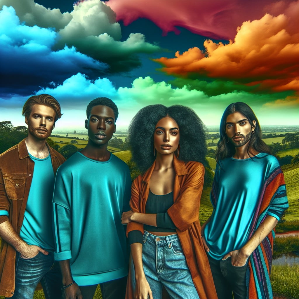
The combination of teal and orange brings a vibrant contrast that stands out against natural outdoor settings, ensuring photos pop with color. This pairing capitalizes on the complementary color scheme, making it ideal for creating visual interest and a sense of balance in photographs.
These hues work exceptionally well during golden hour, when the warm sunlight enhances the orange tones and the cooler shadows bring out the depth of teal.
LIME GREEN, WHITE, AND NAVY
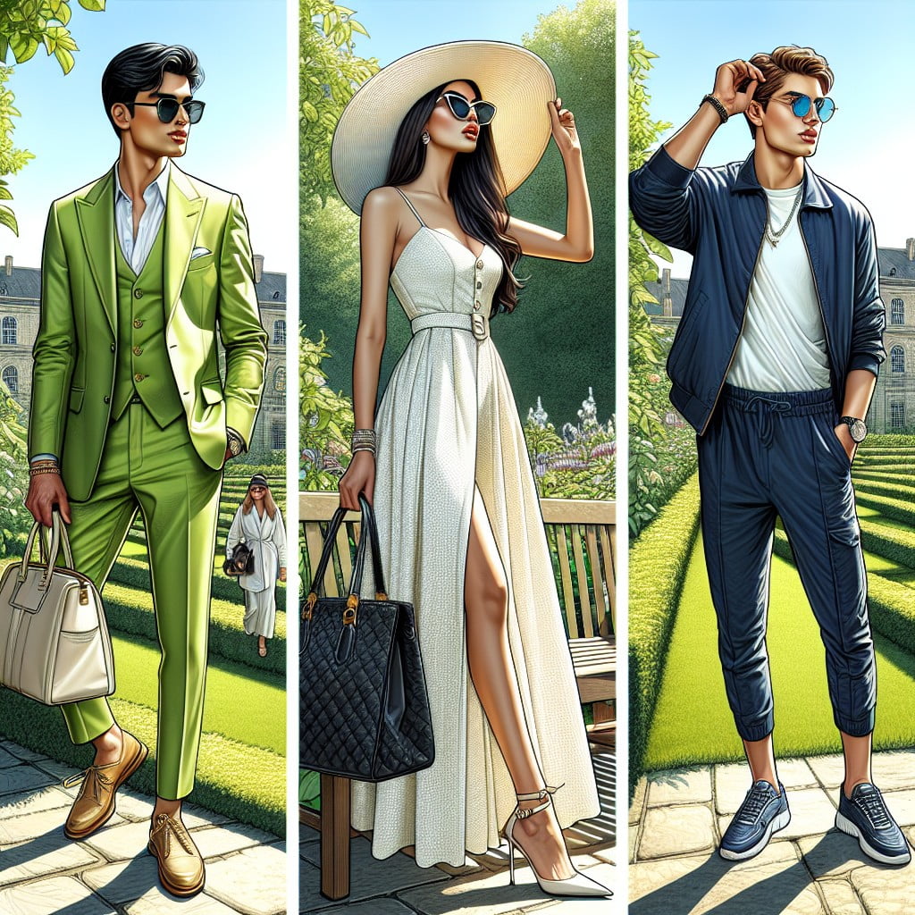
Capturing the vibrancy of nature, a combination of lime green, white, and navy brings a refreshing and crisp contrast to outdoor wedding photos.
The zesty hue of lime green adds a pop of color that stands out against natural backdrops, while navy offers a classic, deep contrast that grounds the palette.
White acts as a balancing element, ensuring the photos have a timeless feel with a clean and bright touch.
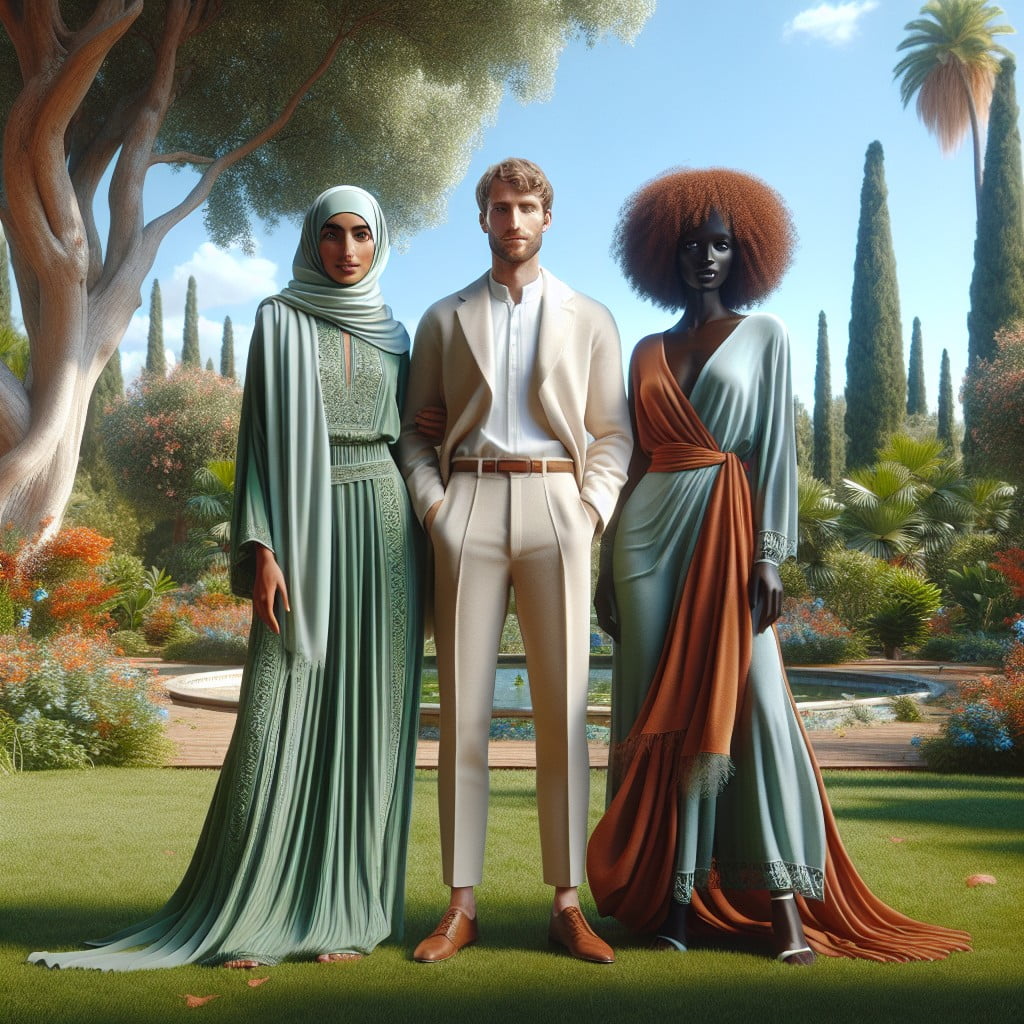
VIOLET, BEIGE, AND EMERALD GREEN
Elevate outdoor wedding photos with a regal and earthy palette comprising violet, beige, and emerald green. The contrast between the luxurious depth of emerald and the soft warmth of beige perfectly complements the rich hue of violet, ensuring that the wedding party stands out amidst natural backdrops.
This color combination strikes a balance between sophistication and natural harmony, ideally suited for lush garden or forest settings.
LEMON, BLUE AND WHITE

Bright lemon tones offer a cheerful contrast against blue hues, evoking a fresh and vivid palette for outdoor photos. The addition of white helps balance the intensity of lemon and blue, ensuring that the colors pop without overwhelming the scene.
This combination is especially flattering in natural daylight and can complement both lush greenery and clear blue skies.
RUST, CREAM AND TEAL
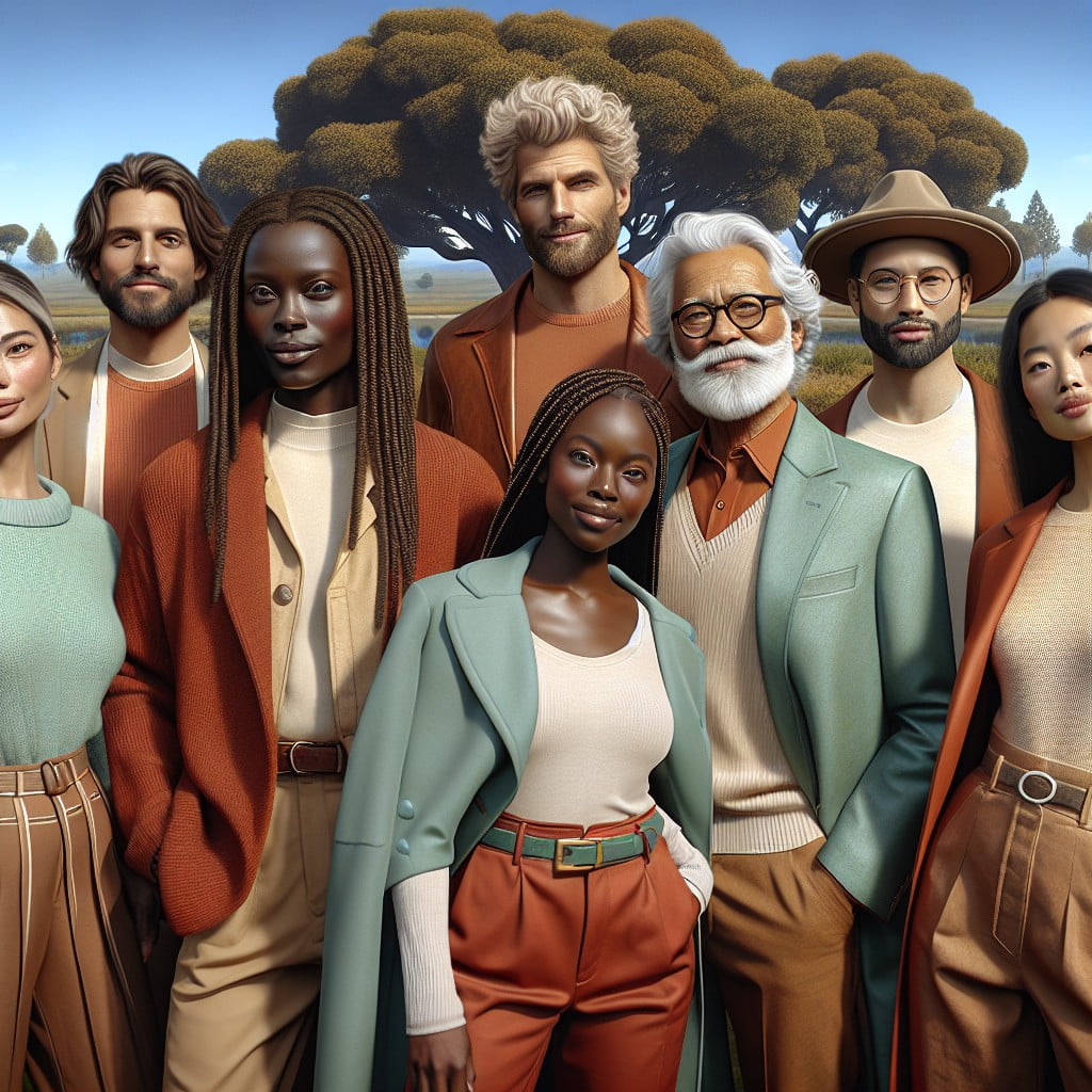
The warm tones of rust compliment the softness of cream, creating a cozy yet vibrant aesthetic for outdoor photographs.
Teal adds a pop of color, offering a striking contrast against natural backdrops like autumn foliage or rustic settings.
This rich color palette is especially flattering in golden hour lighting, enhancing the overall warmth and depth of the images.
CHAMPAGNE, WHITE AND GOLD
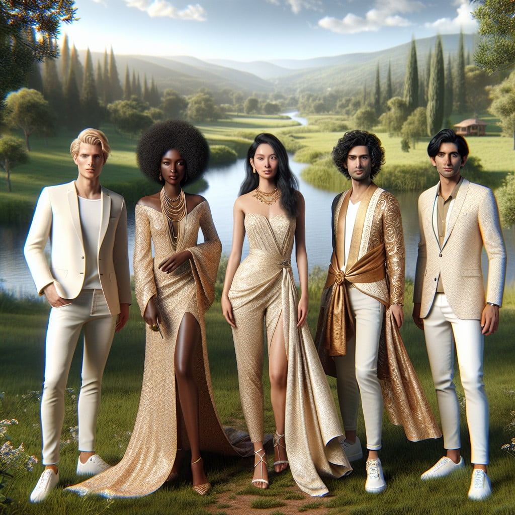
Champagne, white, and gold create an elegant and timeless palette that radiates sophistication in outdoor photography.
The soft shimmer of gold accents enhances the natural light, making this combination perfect for sunset or golden hour photo sessions.
White adds a clean, classic touch, ensuring that the subjects stand out amidst any outdoor backdrop.
INDIGO, PEACH AND WHITE
The combination of indigo and peach provides a stunning contrast that pops in natural lighting, ideal for outdoor photography.
White acts as a neutral balance, ensuring that the vibrant indigo does not overwhelm the softer peach tones.
This color palette echoes the hues of a sunset, lending a romantic and serene vibe to the photographs.
MUSTARD, CHARCOAL AND BROWN
The warm tones of mustard blend harmoniously with the deep, grounding hues of charcoal and brown, providing a rich palette for outdoor photography.
This combination evokes an autumnal feel, perfect for natural settings with earthy backdrops.
The contrast created by these colors ensures that subjects stand out in the natural light.
MAGENTA, GREY AND BEIGE
The magenta adds a vibrant pop of color against the natural backdrop, perfect for a lively touch in photographs.
Grey serves as a balanced neutral, ensuring that the magenta stands out without overwhelming the scene.
Beige offers a subtle warmth, complementing both the magenta’s energy and the understated elegance of grey.
CHERRY RED AND BLACK
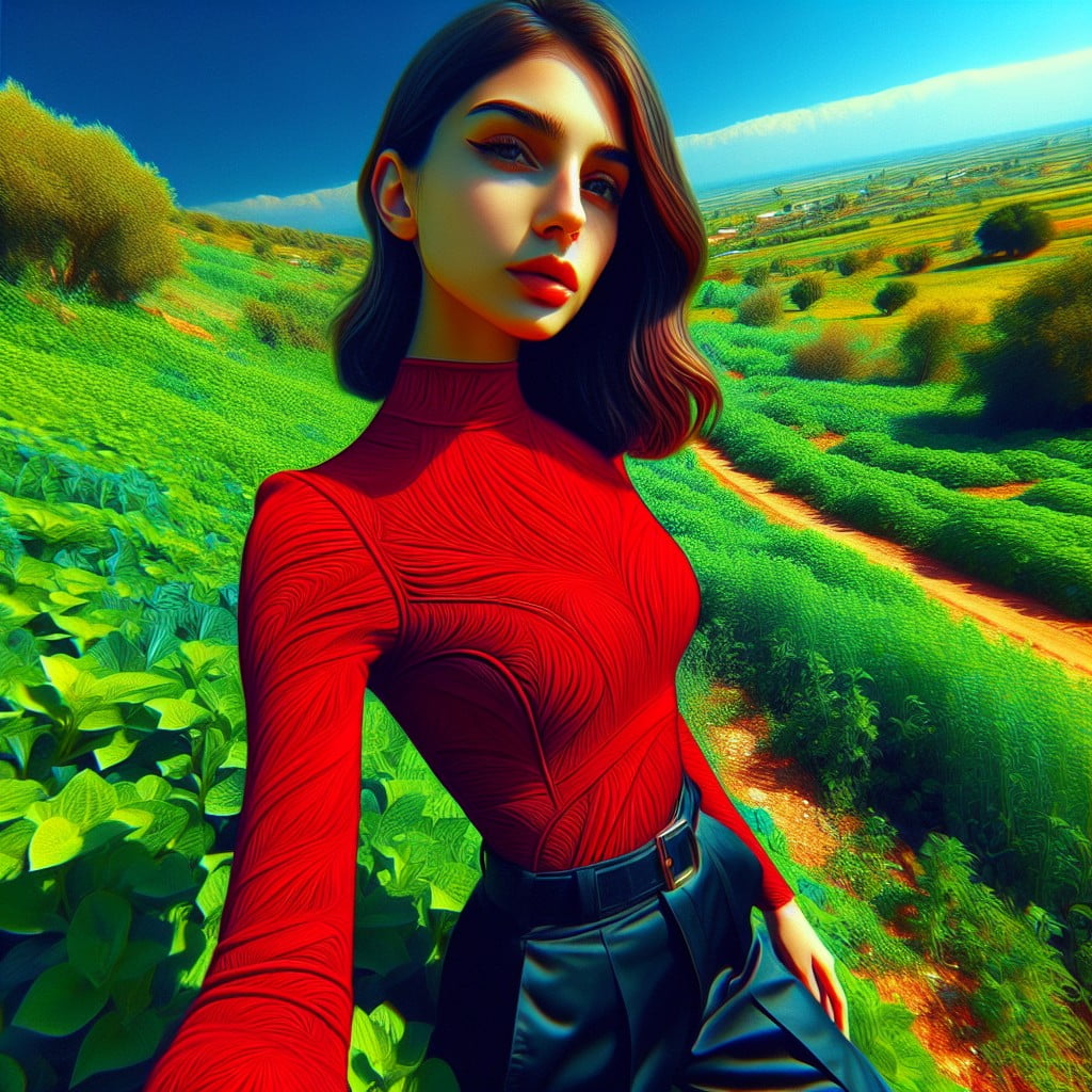
Cherry red stands out vibrantly against natural backdrops, ensuring a pop of color in outdoor wedding photos.
Black adds a touch of sophistication and contrast, making the color scheme especially striking in autumnal settings or during dusk photoshoots.
This bold pairing commands attention and encapsulates a timeless elegance.
MINT, CREAM AND RUST
This color palette offers a refreshing contrast, with mint bringing a cool, calming vibe and cream adding a neutral backdrop that complements the natural setting.
Rust accents provide a warm, earthy touch that anchors the ensemble, ensuring that the attire stands out against outdoor greenery.
These tones work well for all seasons, adapting seamlessly to the changing backdrop of outdoor photography.
SALMON, CHARCOAL AND TAN
The blend of salmon’s soft warmth with charcoal’s grounded sophistication creates a pleasing contrast that stands out in natural light.
The addition of tan as a neutral base balances the color palette, ensuring that no single hue overwhelms the photograph.
This color combination harmonizes with outdoor settings, enhancing the organic tones present in woodlands, beaches, and parks.
Ideas Elsewhere
- https://www.kristenfottaphotography.com/best-colors-family-pictures-outside/
- https://beccajeanphotography.com/colors-to-wear-for-family-photos/
- https://southerntide.com/blogs/the-southern-edit/secrets-to-taking-family-photos
- https://www.kw-photography.co.uk/what-to-wear-to-your-outdoor-family-photoshoot/
- https://bellawangphotography.com/what-to-wear-outdoor-family-pictures/
- https://www.flytographer.com/blog/best-colours-for-family-pictures-outside/
- https://shotkit.com/colors-outdoor-family-pictures/
But Wait, There's More
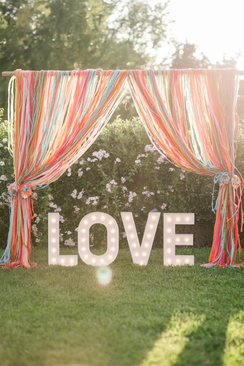 51 Festival Style Wedding Decor Ideas Full of Color and Love
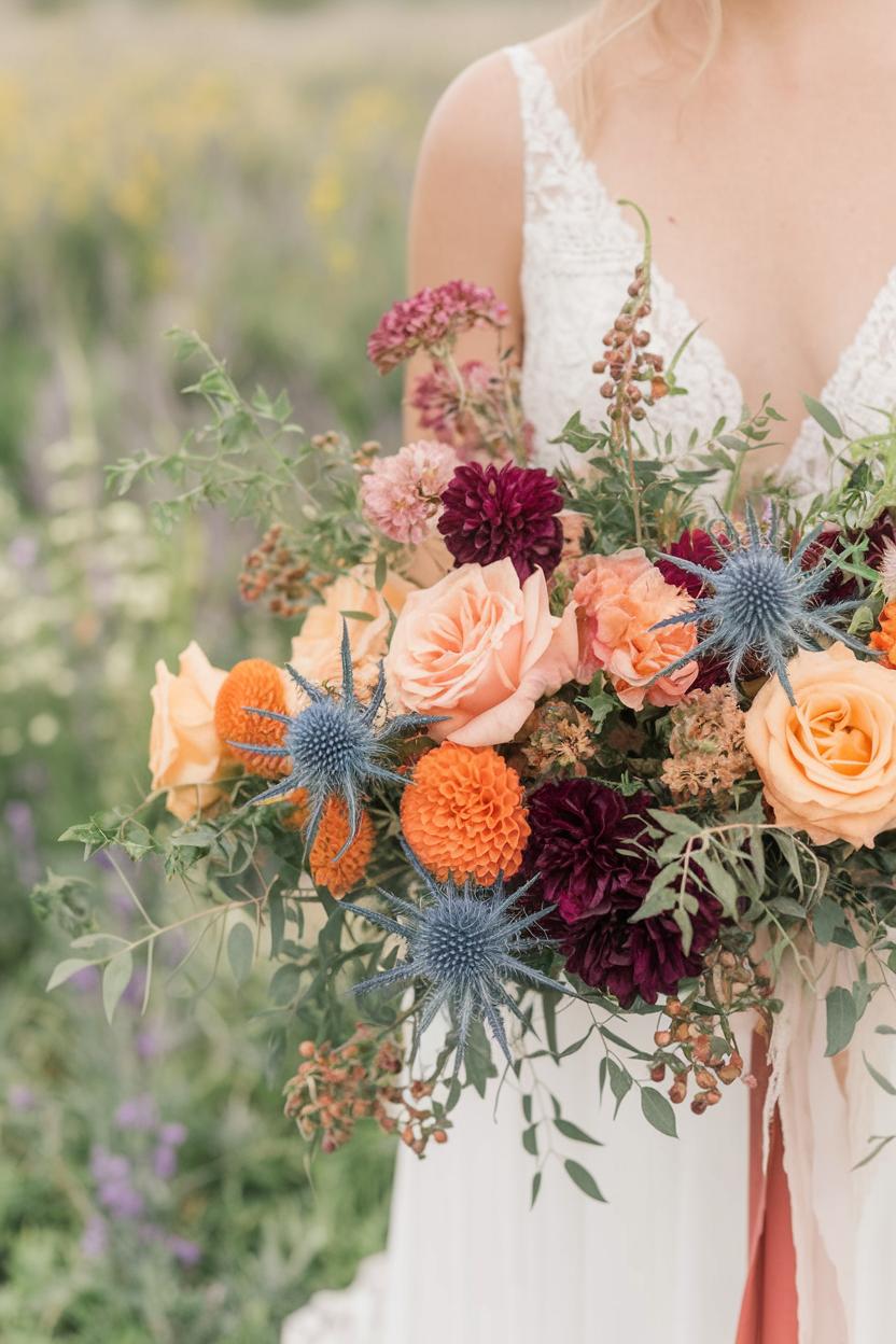 64 Boho Wedding Bouquet Ideas with Wildflowers
 33 Stunning Tropical Wedding Ideas for a Paradise Celebration
 85 Outdoor Wedding Arch Ideas for a Picture-Perfect Ceremony
 39 Boho Beach Wedding Ideas Full of Free-Spirited Magic