Delving into the vibrancy of color-coordinated outfits, this article provides a thorough guide because the right mix of colors can elevate any photo shoot to a professional level.
“Warm Vs Cool Colors: Best Picks for Outdoor Photoshoots”
Choose warm colors like reds and oranges to pop against green landscapes and blue skies, enhancing the festive feel of outdoor events.
For cooler months or seaside settings, outfits in blues and purples will complement the serene backdrop and evoke a sense of calm.
When planning outdoor wedding photoshoots, consider the natural color palette of the venue to decide on the ideal outfit hues.
“How to Create a Harmonious Look With Analogous Colors”
Selecting analogous colors involves choosing hues that are next to each other on the color wheel, such as blues and greens or oranges and yellows, which naturally work well together.
This approach creates a visually soothing palette for your outfits, ensuring that the group appears cohesive without being overly matchy-matchy.
With this method, you can easily build an outfit with varying shades and tints that blend harmoniously, ideal for a seamless look in group photographs.
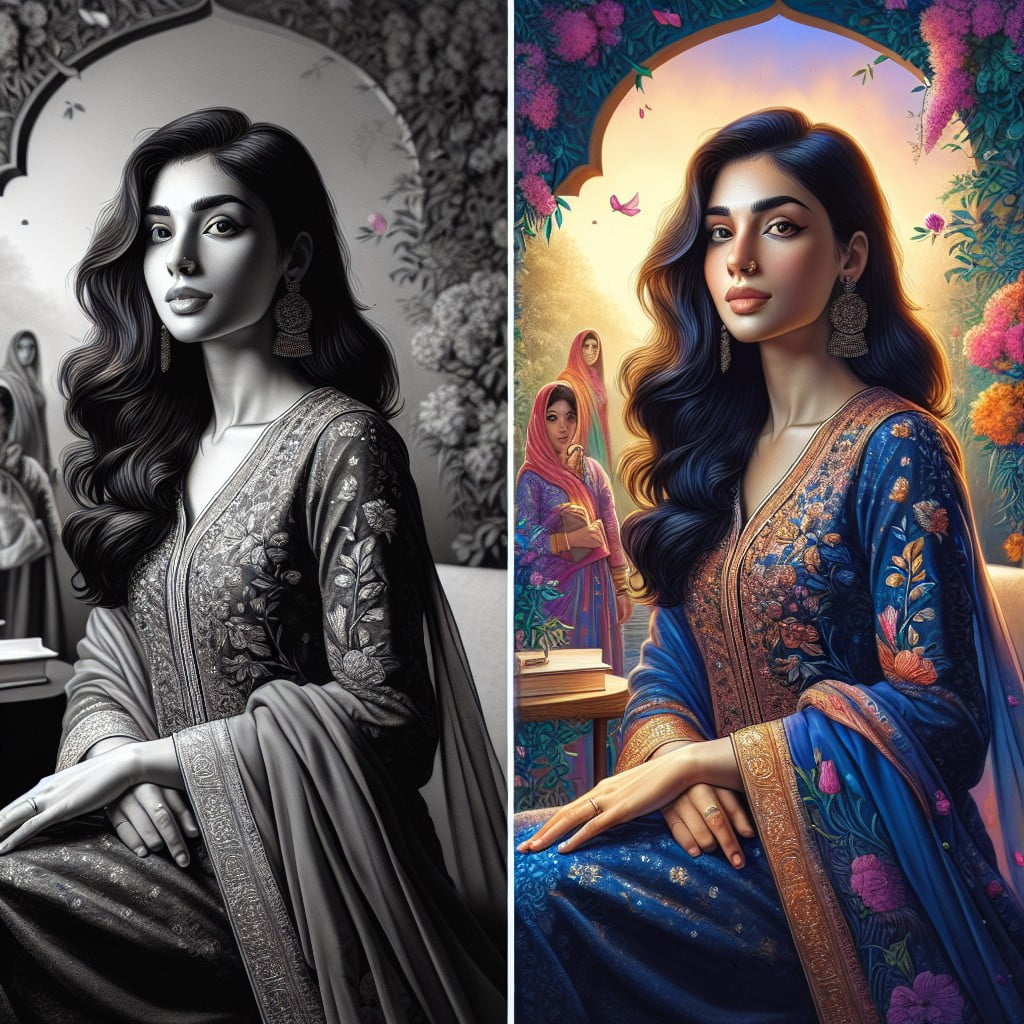
“The Power of Monochromatic Outfit for a Minimalist Photoshoot”
Monochromatic outfits create a unified and cohesive look, drawing focus to the subjects without visual clutter. They allow the photographer to play with textures and shades, adding depth while maintaining simplicity.
The simplicity of a single color palette highlights the natural beauty and emotions of the subjects, making it a timeless choice for minimalist photoshoots.
“How to Rock Bold Colors for Family Portraits”
Choose a vibrant primary color to serve as the focal point for one family member, then coordinate with secondary pops of color in accessories for the others.
Opt for solid, bold-colored tops to create a captivating visual unity while keeping pants and dresses in neutral tones to ground the look.
Incorporate color blocking in your attire to add dynamic interest and depth to the family portrait without overwhelming the scene.
“Earthy Tones: Ideal for Forest and Garden Photoshoots”
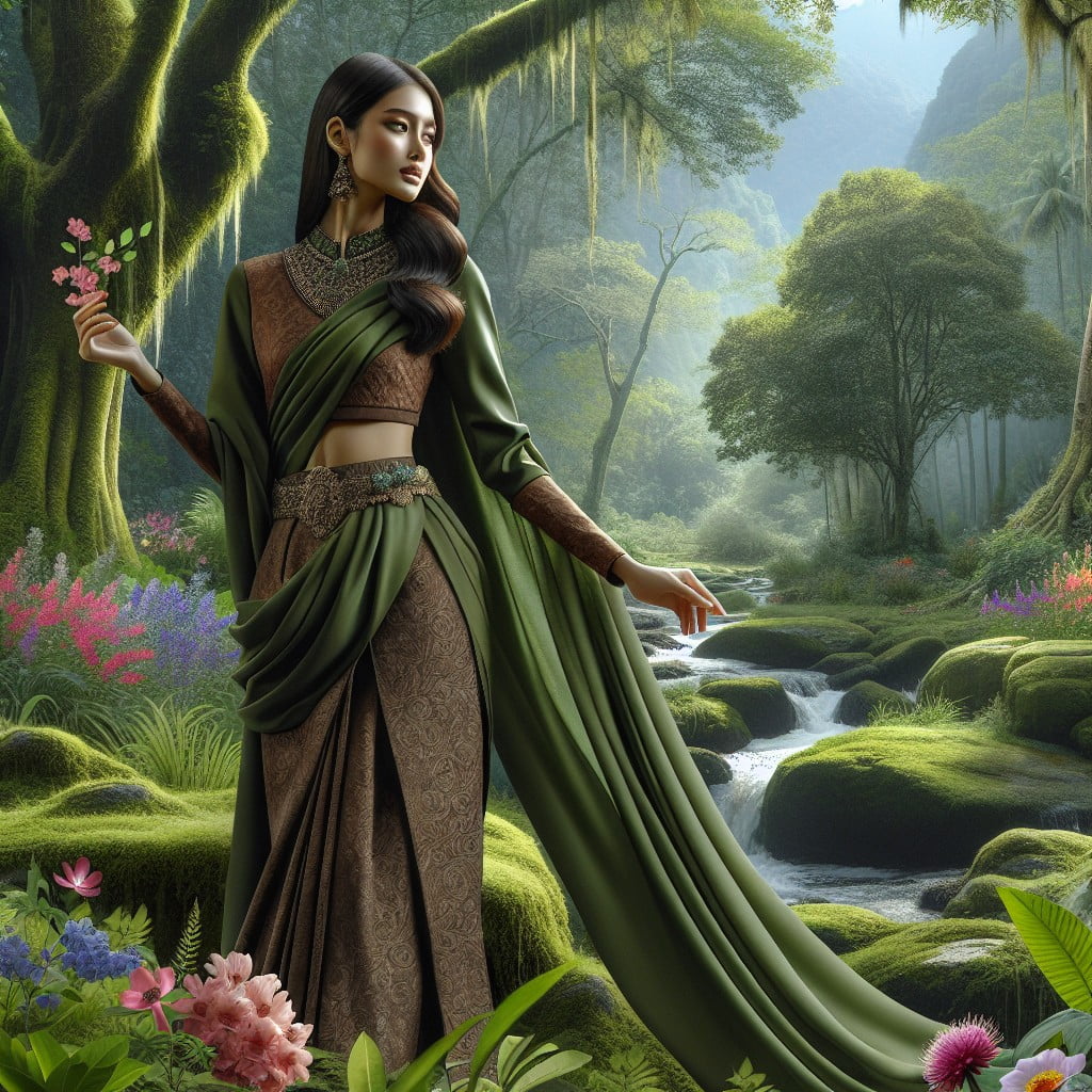
Outfits in earthy tones like moss green, deep browns, and soft tans blend seamlessly with nature-rich backgrounds, enhancing the organic appeal of forest and garden settings.
They evoke a timeless, romantic aesthetic perfect for couple or solo photoshoots in natural landscapes.
These hues highlight the inherent beauty of the outdoors, subtly complementing the greenery and earth without overpowering the scene.
“Mixing Pastels for a Spring-Themed Photo Session”
Incorporate soft pinks, baby blues, and mint greens to embody the rejuvenating essence of spring in your photoshoot apparel.
Outfits with muted lavender or pale yellow can add a delicate, airy feel, perfect for a backdrop of blossoming flora.
Consider layering lighter pastel shades for depth, while maintaining the overall serene palette ideal for the season’s aesthetic.
“Best Color Combination for Fall or Winter Photoshoots”
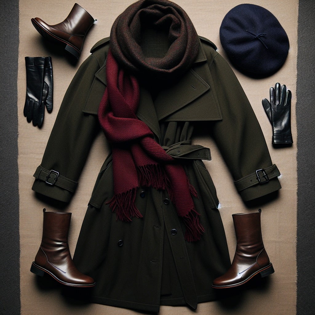
Embrace the season’s palette by pairing rich burgundies with deep forest greens, reflecting the natural hues of autumn leaves.
For winter shoots, icy blues and silvery grays mimic the chilling beauty of frost and snow, creating a cohesive backdrop.
Adding a pop of mustard yellow or ruby red brings warmth to the ensemble and a striking contrast against the cool, subdued environment.
“Maximize Visual Impact With Complementary Colors in Outfits”
Selecting outfits that feature colors directly opposite on the color wheel ensures your group stands out. This approach highlights each individual while creating a visually striking collective image. When the colors contrast, it draws attention to the subjects, making photographs pop with energy and life.
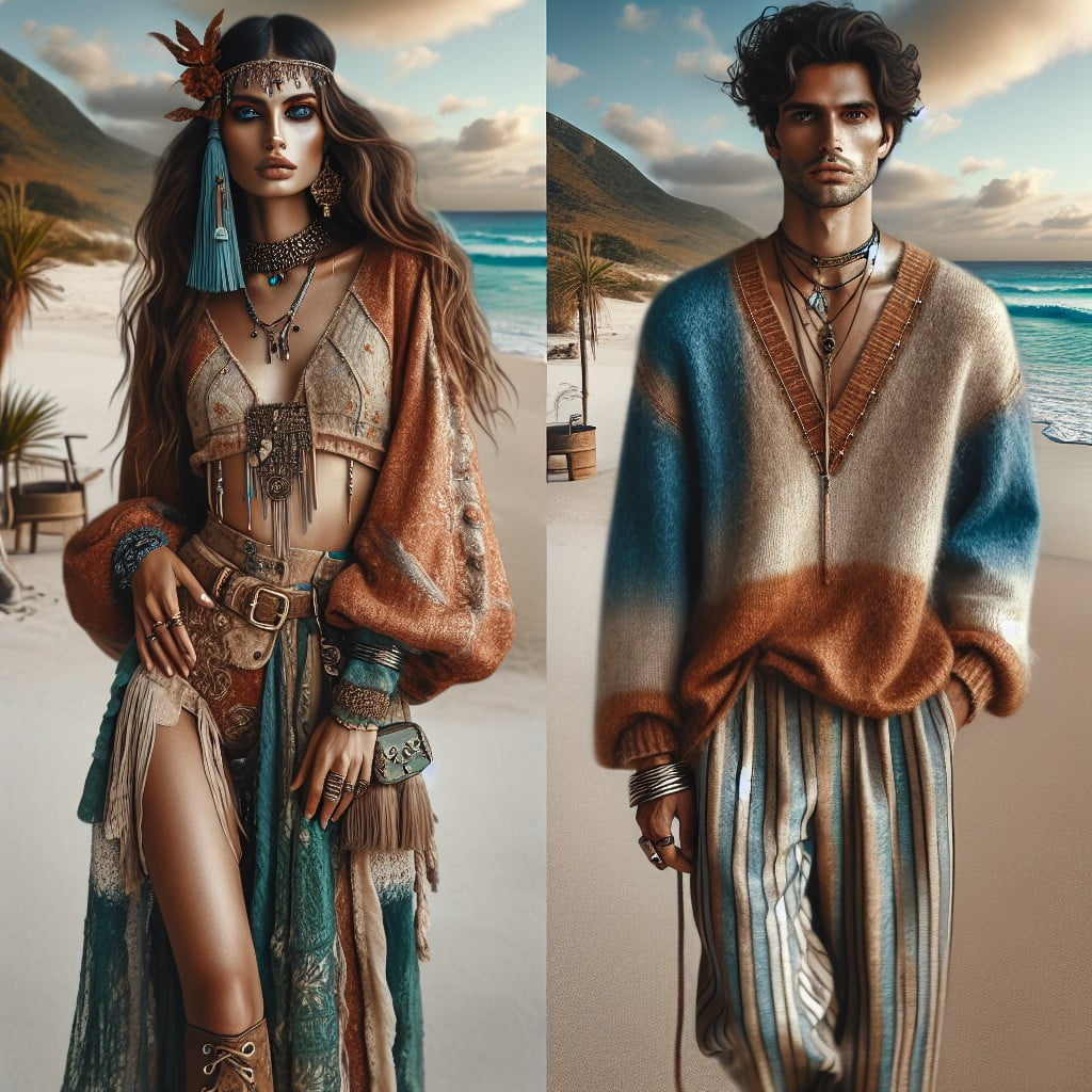
“Photoshoot Outfit Ideas for Beach: Bright Vs Soft Hues”
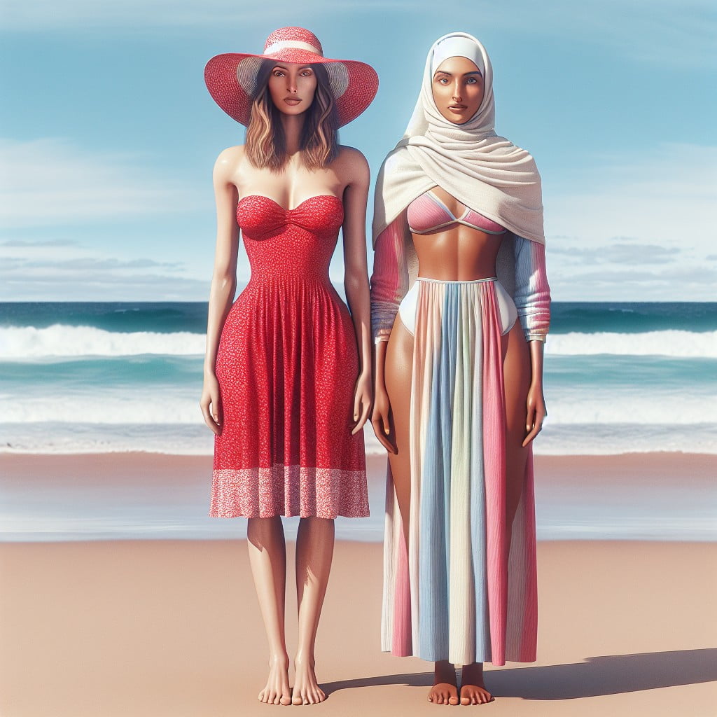
Select bright hues like aqua or coral to complement the vibrant beach backdrop and stand out in photos.
Opt for soft pastels like baby blue or peach for a more subdued, romantic feel against the seascape.
Consider the time of day for the shoot; bright colors pop in the morning sun, while softer shades can be magical during golden hour.
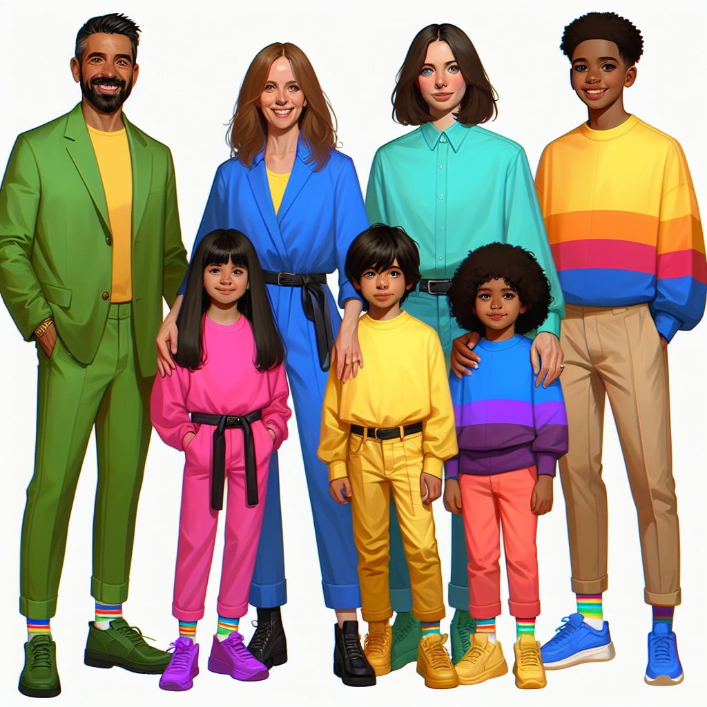
“Infusing Vibrant Colors for a Joyful Family Photoshoot”
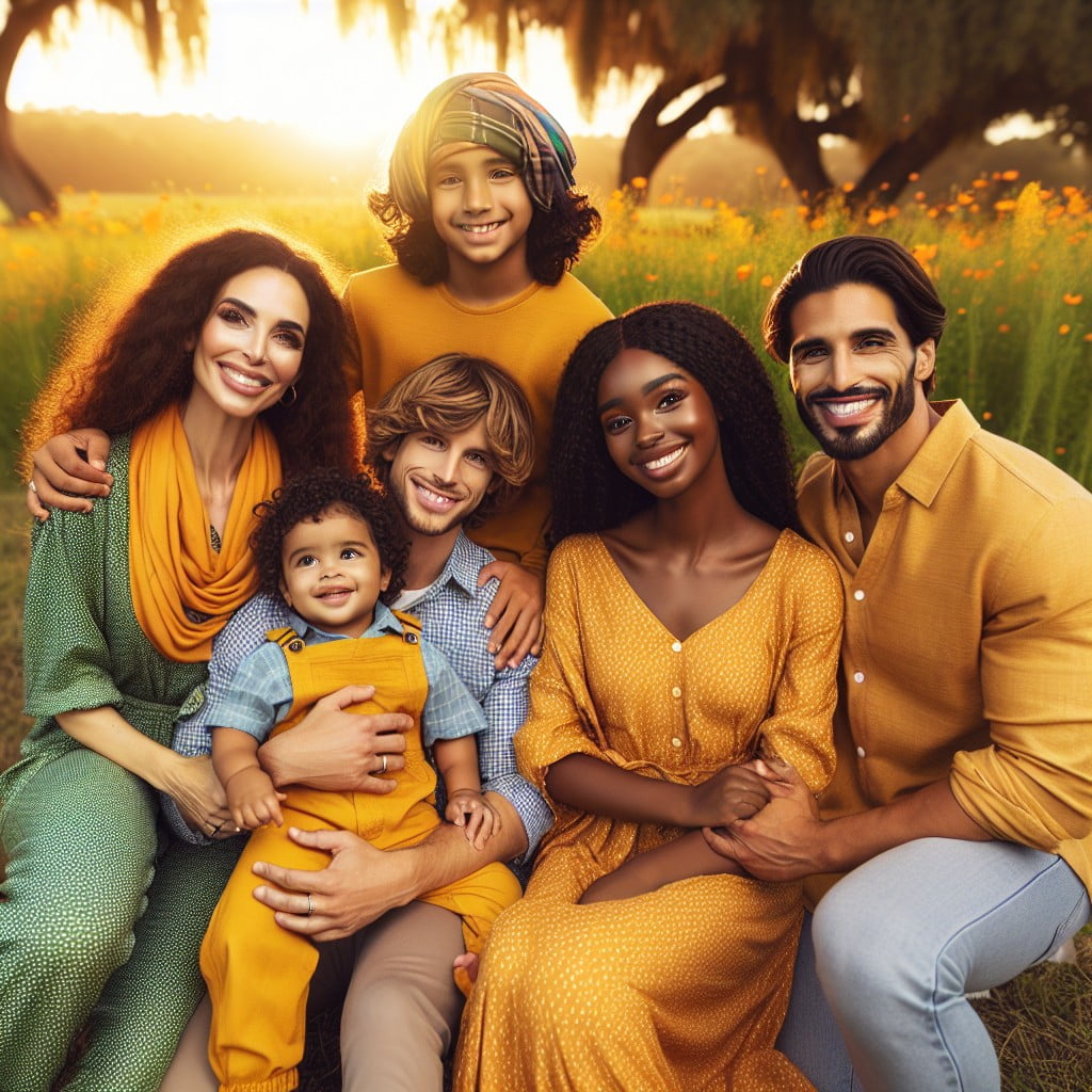
Selecting bright, saturated colors like sunshine yellow or cerulean blue can bring an energetic and cheerful vibe to the photos. Such lively hues work especially well in dynamic group shots, capturing the essence of a family’s happiness.
They can also prevent the photos from looking flat, adding depth and visual interest to the family’s collective ensemble.
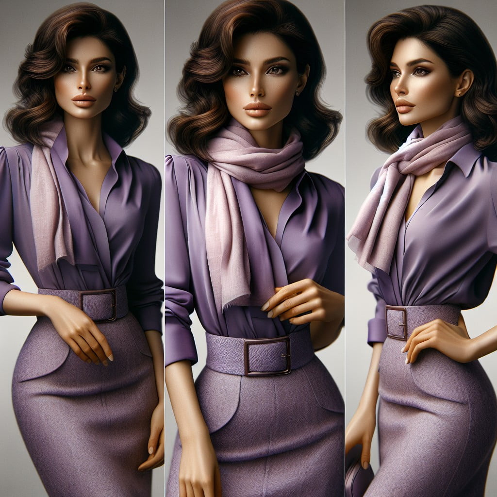
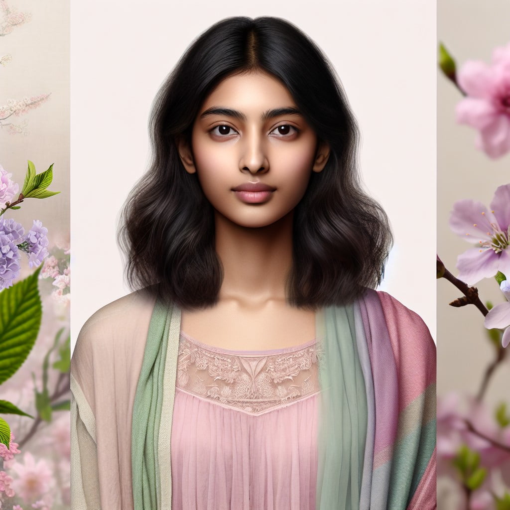
“Subtle Color Pairings for an Elegant Photoshoot”
Opt for soft shades like blush, cream, or light gray to achieve a refined aesthetic.
Utilize colors that naturally blend, paying attention to slight variations in hue to add depth while maintaining a muted palette.
These understated combinations create a timeless and sophisticated look in photographs.
“Enhancing Your Features With Strategic Color Placement in Outfits”
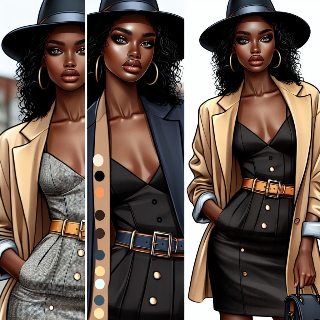
Opt for clothing with color accents in areas you want to highlight, while using darker shades where you prefer to downplay. Choose hues that complement your skin tone and eye color to bring out your natural features in photos. Utilize colored accessories strategically to draw attention to your best attributes, such as a vibrant belt to accentuate the waist.
“Playing With Saturation: From Muted to Rich Colors in Photoshoots”
Utilizing muted colors in outfits can convey a sense of calm and subtlety, allowing the surroundings to take the forefront in your photos.
Increasing saturation brings garments to life, creating a focal point that draws the viewer’s eye to the subjects.
Balancing saturated hues with neutral accessories ensures that the overall effect remains cohesive, not overwhelming.
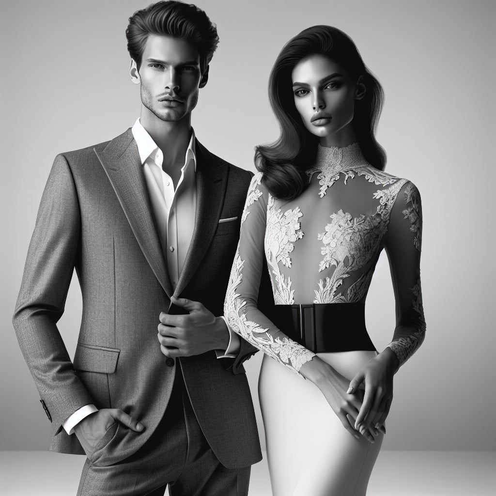
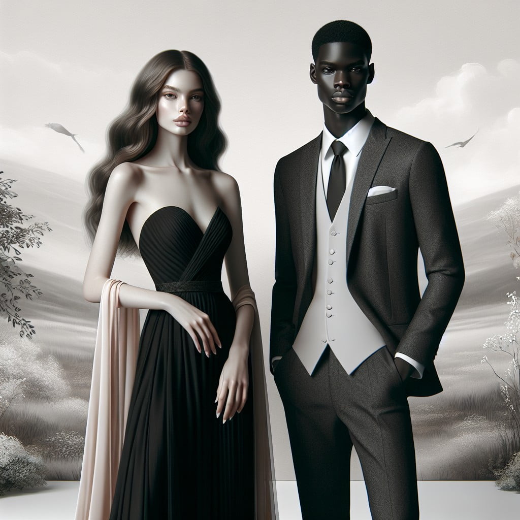
“How to Balance Dark and Light Colors in Your Outfit Choices”
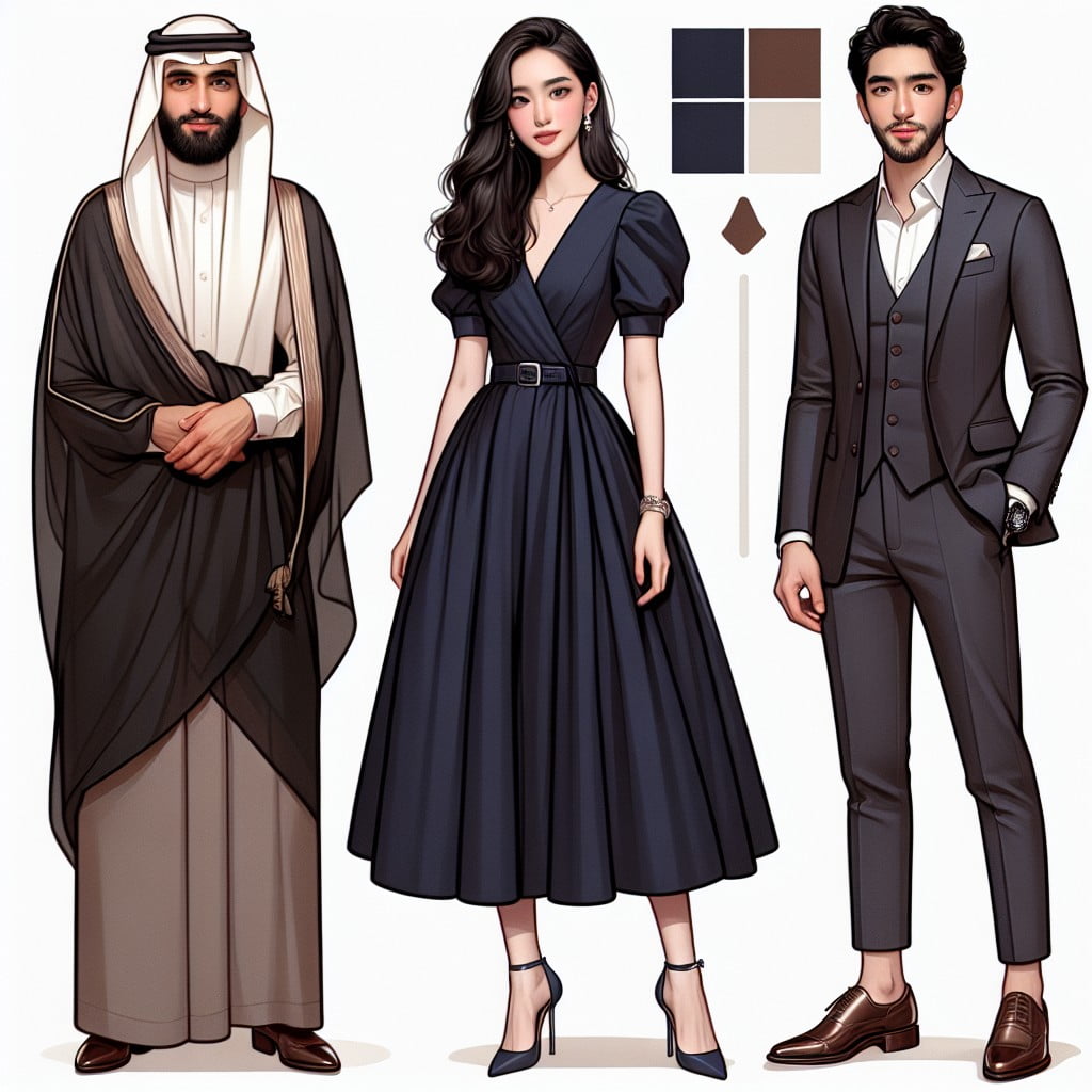
Choose a dominant shade, either light or dark, to serve as the main color for your outfit, ensuring that it complements the wedding theme and setting.
Incorporate accents of the contrasting tone through accessories or clothing detail, such as a dark tie with a light shirt for a touch of sophistication.
Maintain a cohesive look by distributing dark and light elements evenly between partners or group members, avoiding color imbalance in group photographs.
“Styling Striking Outfits With Split-Complementary Colors for Photoshoots”
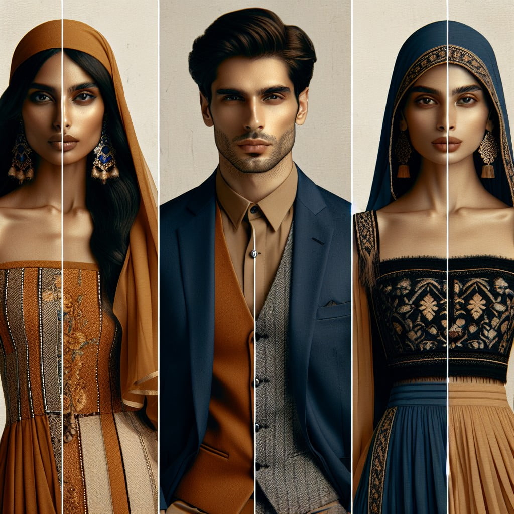
Select a base color and pair it with two adjacent tertiary colors for a vibrant yet balanced ensemble.
This color scheme creates a dynamic visual contrast without overwhelming the photo composition.
Consider using this approach for individual portraits or group photos to add an energetic pop to the imagery.
Ideas Elsewhere
- https://beccajeanphotography.com/colors-to-wear-for-family-photos/
- https://www.adrianaephotography.com/blog-post/how-to-coordinate-family-outfits-for-a-photo-session
- https://www.daturaphoto.net/datura-blog/2022/8/22/what-are-the-best-colors-to-wear-for-family-photos
- https://www.artfulhomemaking.com/what-to-wear-for-family-photos/
- https://www.weddingwire.com/wedding-forums/coordinating-colored-outfits-for-our-families/250500403df894b2.html
But Wait, There's More
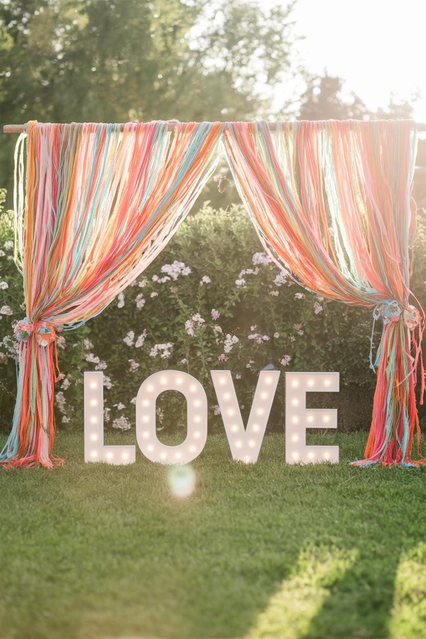 51 Festival Style Wedding Decor Ideas Full of Color and Love
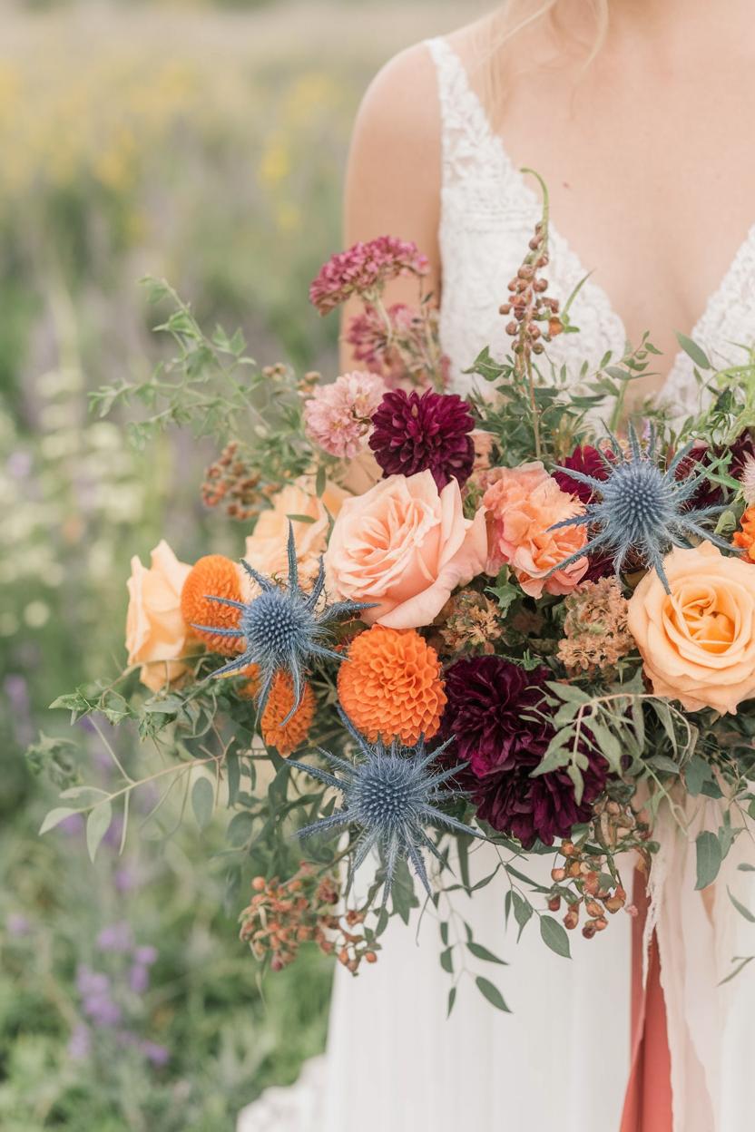 64 Boho Wedding Bouquet Ideas with Wildflowers
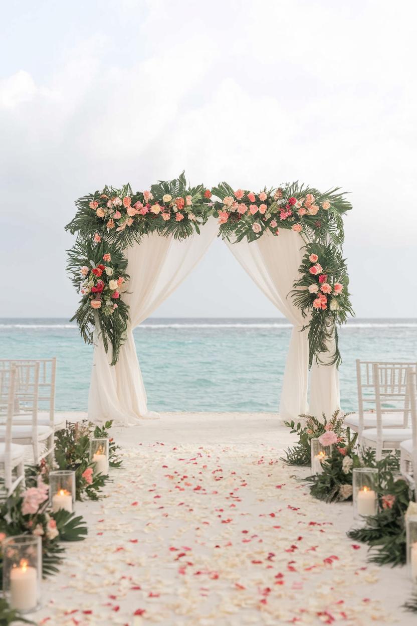 33 Stunning Tropical Wedding Ideas for a Paradise Celebration
 85 Outdoor Wedding Arch Ideas for a Picture-Perfect Ceremony
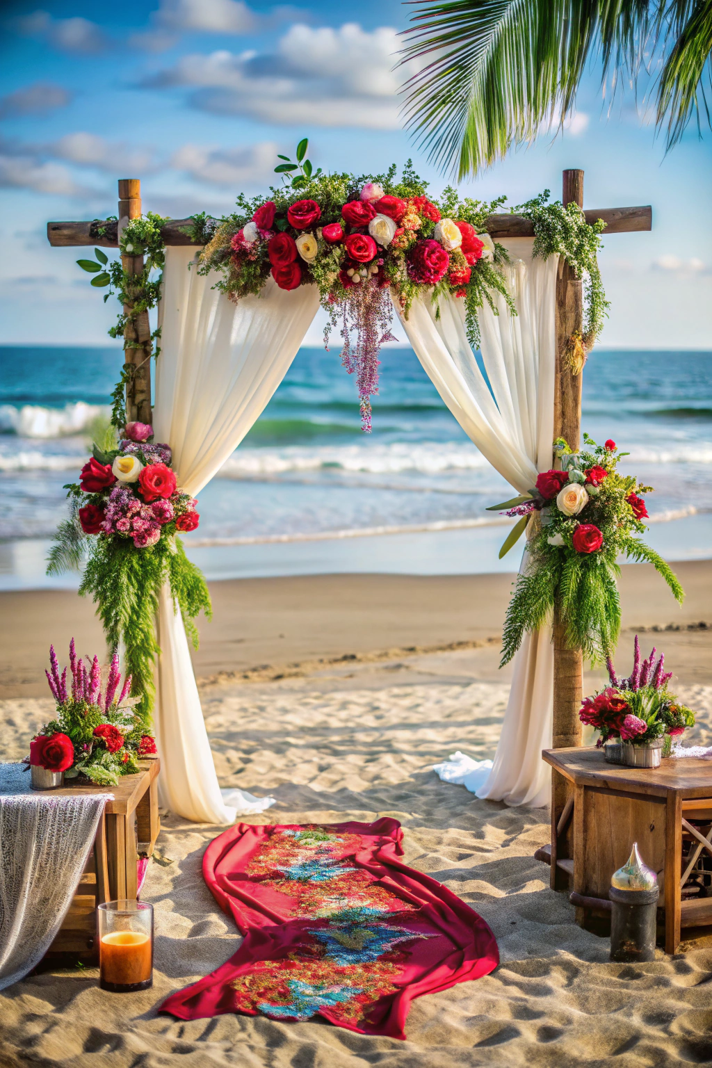 39 Boho Beach Wedding Ideas Full of Free-Spirited Magic