Discover practical tips for selecting the perfect color palette that will set the tone for your wedding day.
Key takeaways:
- Reflect on personal style and venue’s existing palette
- Consider wedding season and venue
- Discuss with significant other and wedding party
- Consult the color wheel and consider seasonality
- Remember the importance of photography in color choices.
Reflect On Your Personal Style and Venue’s Existing Palette
Your wedding embodies your essence and should reflect that in every hue. Start by assessing the tones you naturally gravitate toward in your daily life. What colors dominate your closet? What shades are splashed across your living room walls? These personal preferences are your compass for selecting the right palette.
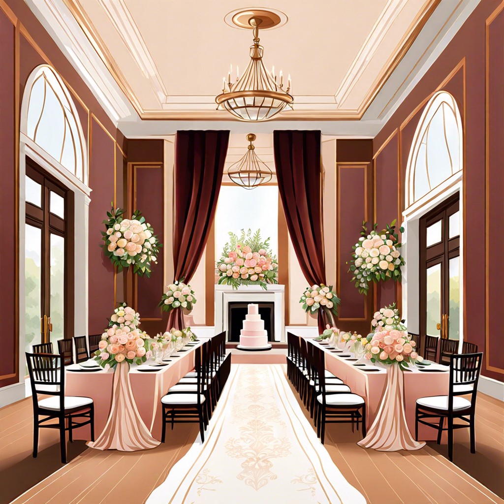
Next, let’s chat about the canvas you’re working with – your venue. Those walls, carpets, and curtains aren’t just background noise; they set the stage for your color symphony. If the site flaunts deep woods and rich textiles, you might opt for warm, opulent shades. A modern loft, with its clean lines and neutral scheme, could invite a pop of vibrant contrast to add that zing.
Balance is the key. Aim for colors that harmonize with, rather than clash against, your venue’s look. This alliance between personal style and venue vibes is like peanut butter meets jelly—the combo needs to be just right. Get this dance of colors in sync, and you’re well on your way to a visually stunning celebration.
Consider Your Wedding Season and Venue
Seasons play a pivotal role in sculpting the color landscape of your big day. A winter wedding might call for crisp whites and icy blues, echoing the serenity of a snow-blanketed scene. Spring nuptials? Think about the rebirth of nature with soft pastels, hinting at blooming flowers. Summer spells out vibrancy with bold and bright shades that mirror the sun’s cheer. When autumn leaves start to turn, so should your palette, with rich, warm tones like burgundy and burnt orange.
Your venue has a say in the palette discussion too. A beachfront bash might borrow hues from the seaside—sandy neutrals with pops of teal or coral. Rustic barn affairs harmonize with earth tones that speak to their natural surroundings. A ballroom might inspire opulent golds or silvers, accentuating the grandeur of the space.
In short, let the season guide your palette like nature’s own design playbook, and let the venue sprinkle in its two cents. This way, your color scheme not only complements the backdrop but enhances the harmonious vibe you’re aiming for.
Discuss With Your Significant Other and Wedding Party
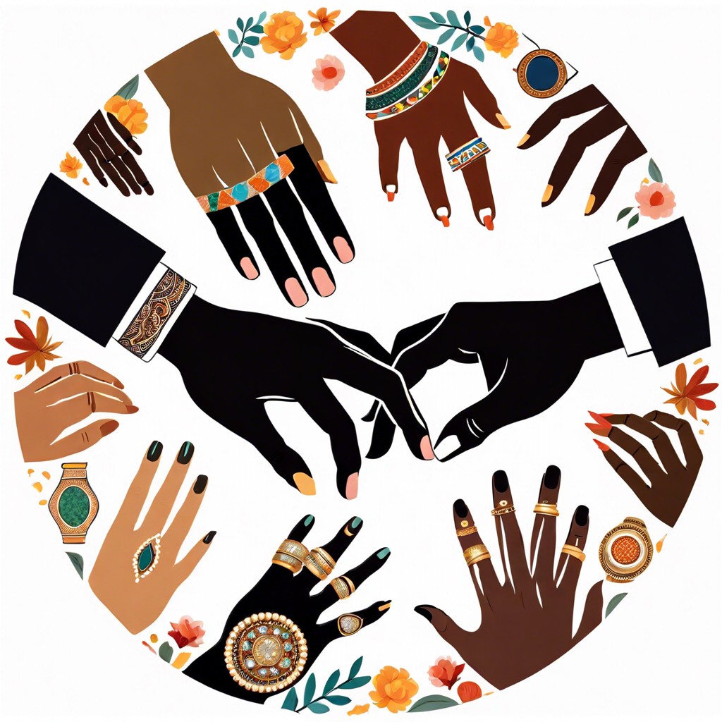
Jumping headfirst into the color selection process solo might seem tempting, but remember, a wedding is a duo gig! Your partner might have shades in mind that could be the perfect piece of the puzzle you didn’t even think of. And guess what? This decision can be a fun way to kick off the collaboration that marriage is all about. Just imagine discovering you both have a soft spot for navy blue or share an aversion to pumpkin orange.
What about your squad? Often, the hues that flatter you might not do justice to your bridesmaids or vice versa. Spare yourself the horror of a color clash on your big day by gathering your wedding party for a candid chat about the palette. It’s like hitting two birds with one stone: You get a rainbow of opinions, and they feel like VIPs in the planning process.
Lastly, while considering everyone’s opinions, toggle that inner diplomat switch and steer the conversation gently. Everyone should feel heard, but remember, this is your masterpiece. The goal is to find a harmonious balance, not a color warzone! Keep it light, keep it breezy, and you’ll have your dream palette with a side of happy memories.
Consult the Color Wheel and Consider Seasonality
A spin on the color wheel can lead to a harmonious palette for your nuptials. Complementary colors, those opposite each other, create a vibrant look, perfect for a lively summer affair. Analogous colors, situated next to one another, weave a more serene vibe, ideal for a tranquil beach dusk ceremony.
Don’t overlook nature’s cue card: seasonality. Autumn’s tapestry lends itself to warm russets and golds, while winter asks for icy blues and silvers, echoing a snow-draped scene. Spring blossoms call for pastels, soft and fresh, and summer’s exuberance is captured in bold, saturated hues.
Matching your color scheme with nature’s seasonal offerings also means florals and decorations may be more abundant and cost-effective. For example, burgundy and forest green resonate well with the fall’s foliage and harvest time, while a spring wedding could capitalize on peony pink or buttery yellow.
Delve into the psychology of color; blue evokes calm and trust, red stimulates appetite and excitement, and green reflects new beginnings. Align these subtleties with your wedding vision for a day that ‘feels’ as good as it looks.
Remember the Importance of Photography in Your Color Choices
Snapshots last a lifetime, so selecting a palette that translates well on camera should be on your radar. Soft pastels might wash out in bright sun, while deep hues can look stark in dim lighting.
Colors dictate mood. Think of vibrant tones for a touch of whimsy or muted shades for classic elegance in your album.
Your photographer’s input can be gold. They’ve seen how different hues play out through the lens and can offer insight into what works best for your setting and theme.
Balance is key – too many colors can create a visual cacophony. Aim for a harmonious blend that complements rather than competes.
Contrast smartly. Shades that pop against your backdrops will ensure you and your significant other are the focal point, while neutrals might serve as a subtle canvas for more vivid accents.
Work with lighting. Your evening reception calls for different considerations than a midday garden ceremony. Select colors that will adapt to the changing light and capture beautifully at every moment.
But Wait, There's More
 How Much Are Wedding Rings: Costs and Factors to Consider
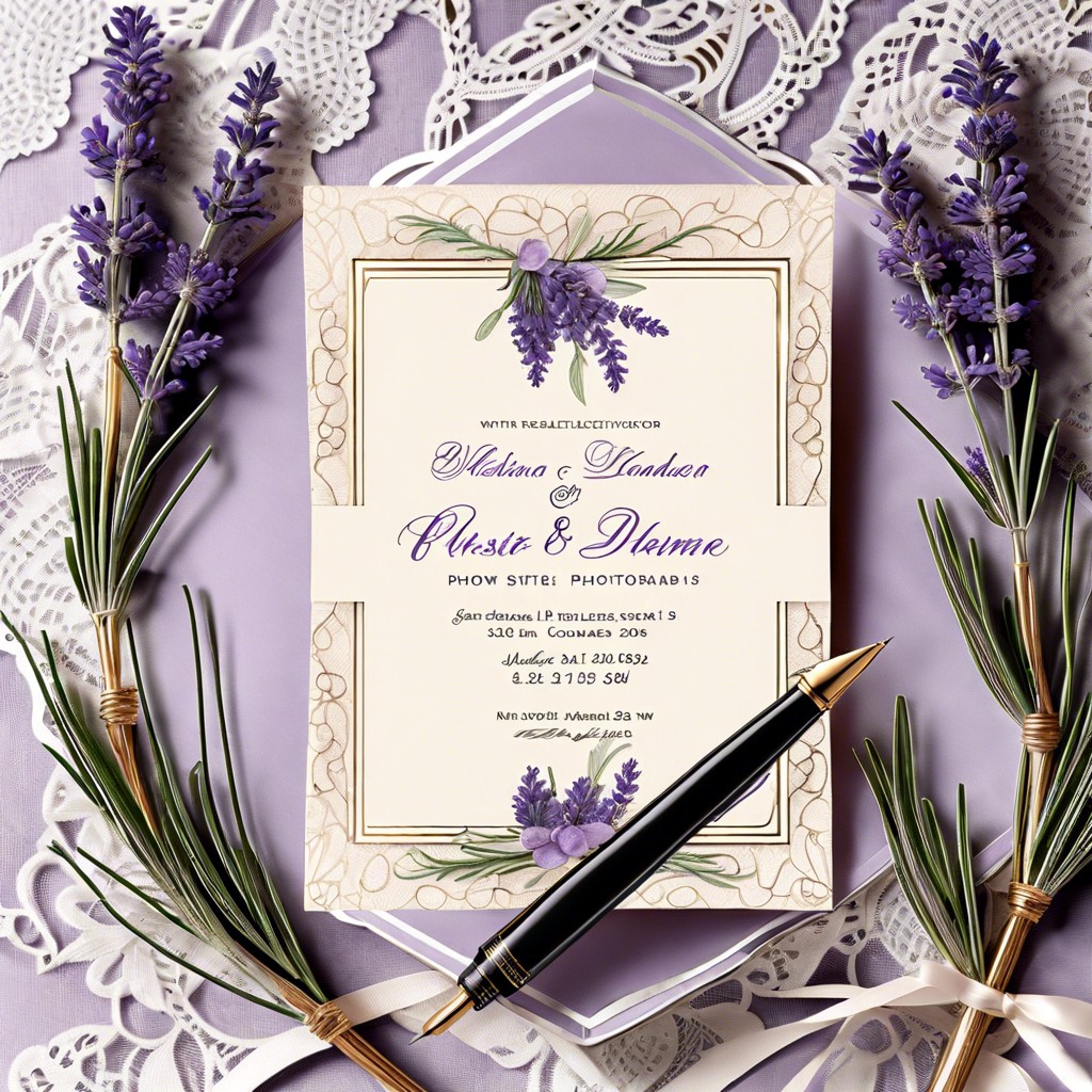 Wedding Envelope Addressing: How to Perfectly Address Invitations for Your Special Day
What to Wear Under Wedding Dress: Essential Tips for Comfort and Style
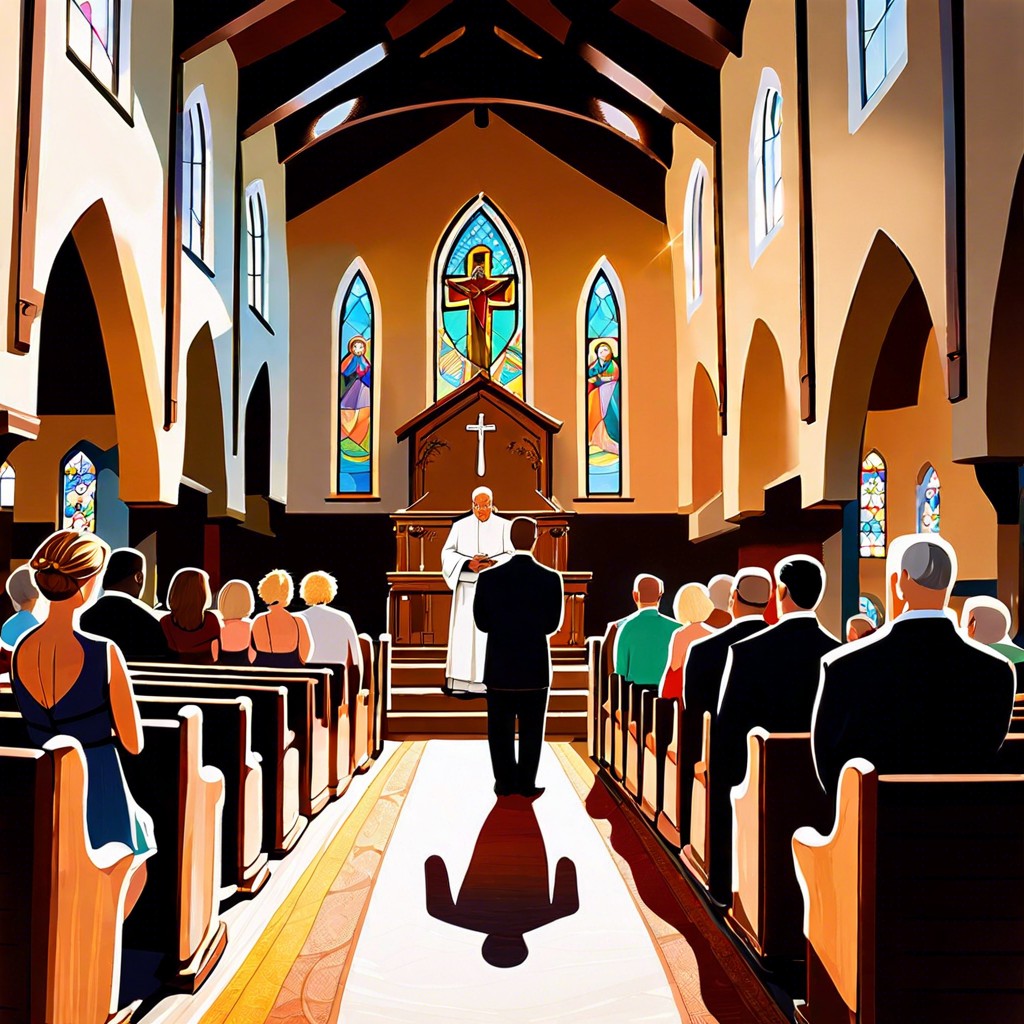 What Does a Priest Say at a Wedding: Traditional Phrases and Their Meanings
 How to Make a Wedding Cake: Step-by-Step Instructions for Beginners